- Thread starter
- #21
- Welcome to the Ford Mustang forum built for owners of the Mustang GT350, BOSS 302, GT500, and all other S550, S197, SN95, Fox Body and older Mustangs set up for open track days, road racing, and/or autocross. Join our forum, interact with others, share your build, and help us strengthen this community!
You are using an out of date browser. It may not display this or other websites correctly.
You should upgrade or use an alternative browser.
You should upgrade or use an alternative browser.
ShiftLife Logo Poll
- Thread starterrpm3dinc
- Start date
This site may earn a commission from merchant affiliate links, including eBay, Amazon, and others.
More options
Who Replied?Grant 302
basic and well known psychic
rpm3dinc said:You could do it this way as well: with the S H F T L E separated and leave the HIF and IF connected...
I don't think connecting the HIF works on the bottom. It looks like too much like a 'W' there. If you want to make the 6 speed gate, I think it needs to be more H-I-F to make the gate more 'regular'. Or make all the letters outlined and just make the gate solid black. Does that make sense?
Block letters are okay, but is it one word or two? I'd rather try to make your original concepts work. The seemingly random connections don't work too well based on the rest of the feedback.
I think Rick's 'top two' would look good staggered like the original #8.
- Thread starter
- #23
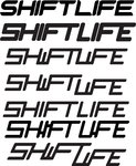
It can either be one word or 2 as far I am thinking of it... I would prefer to keep it 1 line or a slightly offset 2nd line like in example #7.
That way its easier to make decals and such without taking up allot of Vertical space.
The Gates between H-I-F works for the SHIFT word but falls apart with LIFE unless you do I-F-E, which I could certainly try...
I still personally like #14 myself and #7 out of all them... I agree the Gear Indicators either on the inside or outside seem to "Clutter" the look... so maybe I say away from that and thus it makes it easier to read... The ones I did the Border coming out of certain letters are ok, but again I think is still to "Busy", even though there are TONS of logos that have similar looks out there... I understand what everyone is saying as far as seeing a W between the H-F.. Even with the shorter version.. I have also seen Shift Logos with SH/FT like that as well were its either a / Character or a physical Split between SH FT.
I will keep plugging away... but If I HAD to pick 2 today, it would be #14 and #7 without the Gear Indicators... or one of the ones where the letters are separated...
I still like the Slanted look better than the Straight look as well.
- Thread starter
- #24
- Thread starter
- #25
- 157
- 0
I like either of the bottom two on this page.
rpm3dinc said:
Grant 302
basic and well known psychic
rpm3dinc said:
That is what I was thinking on the left side. I don't think it's better than 'Rick's' top two.
It gets progressively harder to see what somebody looking at it for the first time will see. :-\
Even separated, I don't like the shorter 'I'
I think the problem with #7 and #14 are that I see 'SHWFT UFE' every time I look at it.
- Thread starter
- #29
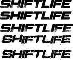
The Issue with the "Busted Block Letters" is Decals would be difficult to make with all those "Shards" and difficult to have Embroidered, etc...
Its not just about "Looks", but function as well... I can have the best looking font or design out there, but if it doesn't translate into Decals/Embroidery, (i.e. Merchandise), its all pointless.
I like the look of the font for the "Busted Block Letters, and even the other distressed Block Letters", but they don't translate well because of how they look. So then your left with the Solid Block Look, and that while ok is just "Blah"... IMHO.
- Thread starter
- #30
- Thread starter
- #31
OK, so after looking at each of the logos from a "Higher Viewpoint" Aka Looking Down on them... Only a few really "Stood Out" and I could tell what they said...
Here are 2 of those that "Might Work"
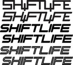
With Exception to these below... I believe that "Slanted or Italics" works best... I also like the I's to be Tall Versions (Especially in SHIFT).. Life can be either tall or short I's
I also think I can make the letters "Thicker" and that might help as well.. (see example Below)


- Thread starter
- #32
After much thought and about 150 different ideas... I finally chose this one:
I will mainly use the middle version (Slanted)...
Now on to the fun stuff of designing decals, shirts, etc.. and getting products up for sale... I hope you all enjoy them...
BTW, make sure to "LIKE" the Facebook page!
https://www.facebook.com/pages/ShiftLife/1456287911259327
I hope to have the website going soon...

